
Color Psychology 101: The Science Behind Color Experience
- ivityco
- Nov 11, 2024
- 3 min read
Have you ever walked into a space and had an immediate reaction - good or bad? While it may not have been intentionally done, chances are color had something to do with it.
As an interior designer, I've watched firsthand how something as seemingly simple as color can transform how people experience things. Whether it's space, an object, or even an advertisement - color makes a difference. It affects our mood, evokes emotions, and can even affect our behavior and mental health.
This, my friends, is the art of color psychology, and there are some really simple but effective ways to use it in your own space in a meaningful way.

First things first. It's important to know that each color has a powerful impact on our psyche, emotions, and behaviors. While there are some common generalizations about human responses, not everyone will respond the same way to the same color one hundred percent of the time. Our personal experiences and beliefs play a big role in our interpretation.
This is why I always say to clients that it's critical when it comes to your home, that the personal perspective of you and those you live with should always be the priority - not what's trendy or what your designer's style is.
Color Psychology Basics
Below is a guide to get you going toward a palette that will bring out the best in your home. While each color should be considered on its own merit, a high level look at warm colors, cool colors, and neutral colors is a great place to start.
Warm Colors
Warm colors like red, orange, and yellow (generally speaking anything that makes you think of 'hot' things) can create add anything from warmth and comfort to energy and excitement. These colors are great for social spaces like the living room or dining room, where you want to encourage conversation and social interaction.

Cool Colors
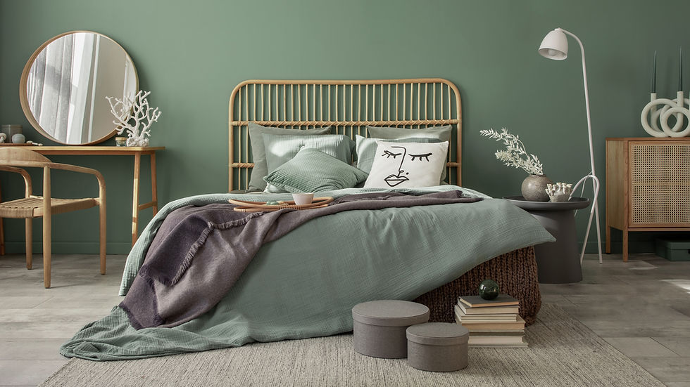
Cool colors like blue, green, and purple, (colors that make you think of cold things) on the other hand, can create a sense of calm and relaxation. These colors work well in bedrooms and bathrooms, where you want to create a peaceful and tranquil atmosphere.
Neutral Colors
Neutral colors create a sense of balance and harmony. Try out white, black, grey, beige, and cream for starters. The best part about neutrals is that they work great as the majority color in a room, but also add a special something as an accent.

How Can You Use Color Psychology in Your Home?
Always remember, it's not just about choosing the right colors for each room, it's about understanding how different colors will make us feel in a room.
For example - would you paint your bedroom fire engine red? Why or why not? What about painting your office electric yellow? Visualizing color in space can help you start to see how color affects you and makes you feel - and it's different for everyone. So, if there's no clear answer to it, how do you use color effectively in your home?
A low-commitment way to do this is through accent walls or statement pieces. If you love blue but don't know if you're ready to commit - start with fairly neutral colors throughout and add an accent wall or blue curtains or throw pillows. Colors can also come in nicely through artwork and accessories - this allows you to experiment with different colors, without a full room makeover if it doesn't go as intended.

Remember, interior design isn't about following trends or replicating a particular style. It's about creating a space that reflects your style and makes you feel happy and at home. A simple understanding of how to interpret color and how it makes you feel will help you create a space that looks beautiful and makes you feel good.
So go ahead, embrace the power of color, see where it leads you, and most importantly - stay inspired!


Comments